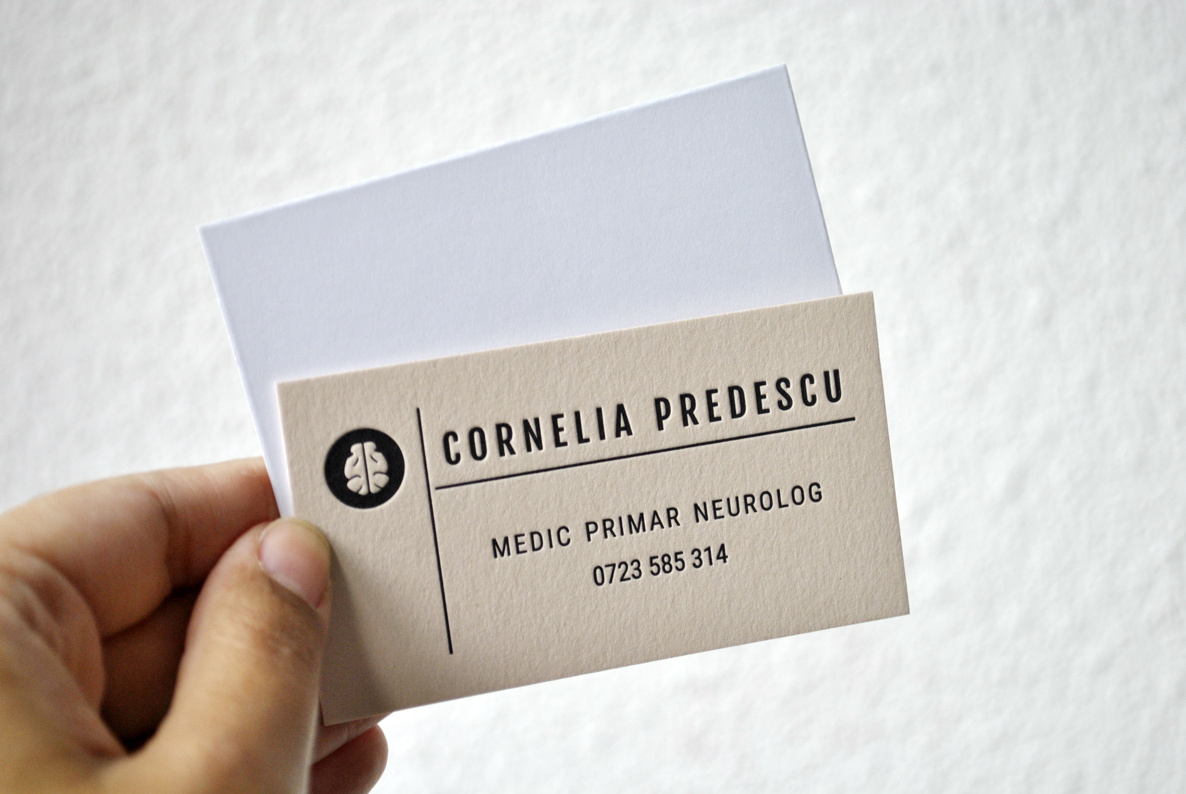
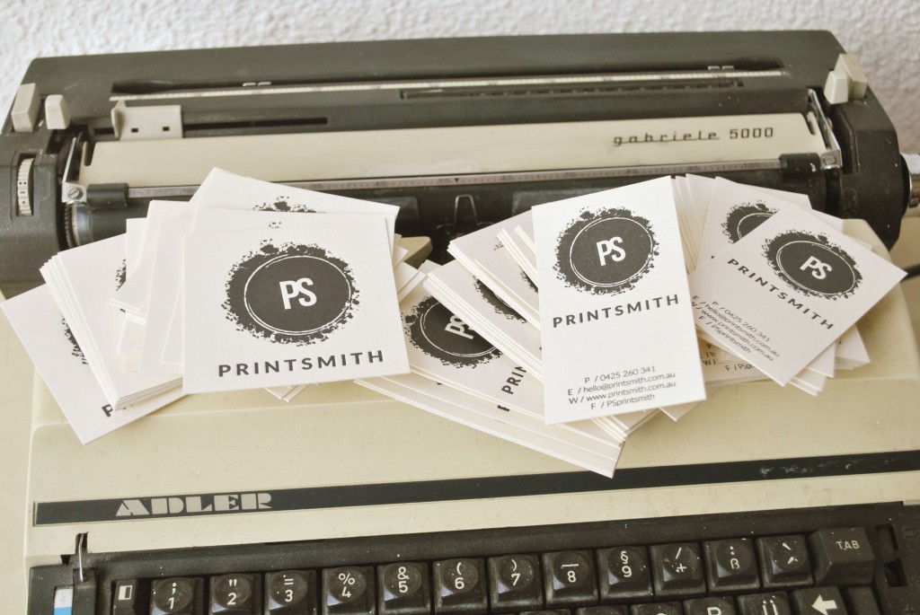
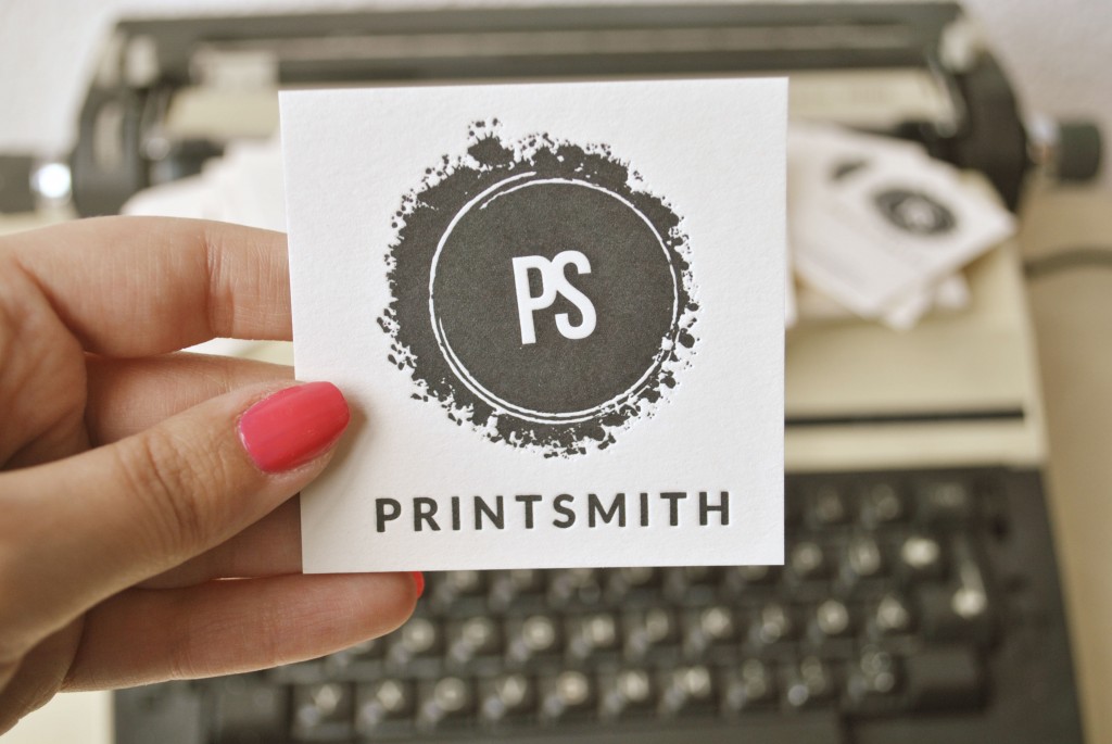
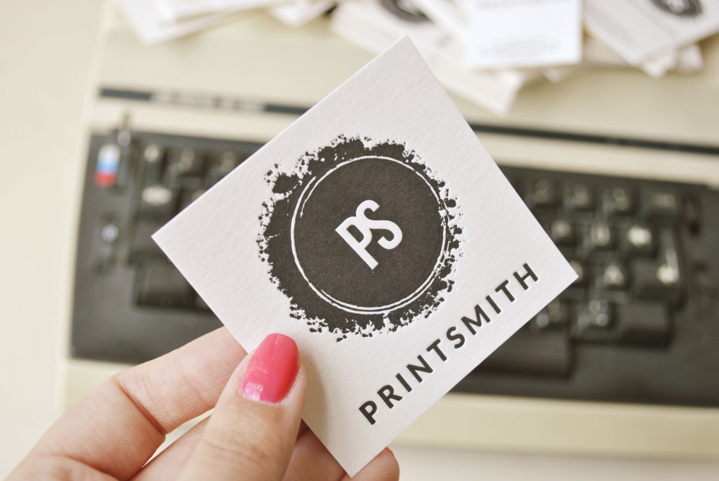
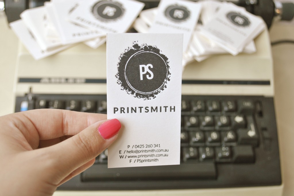
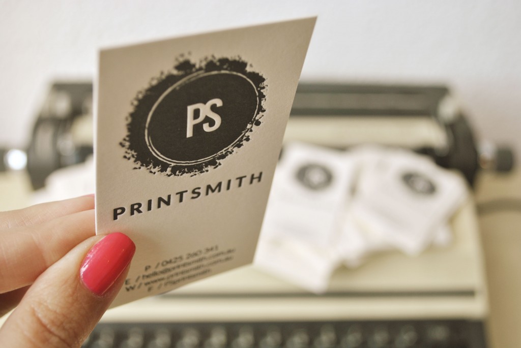
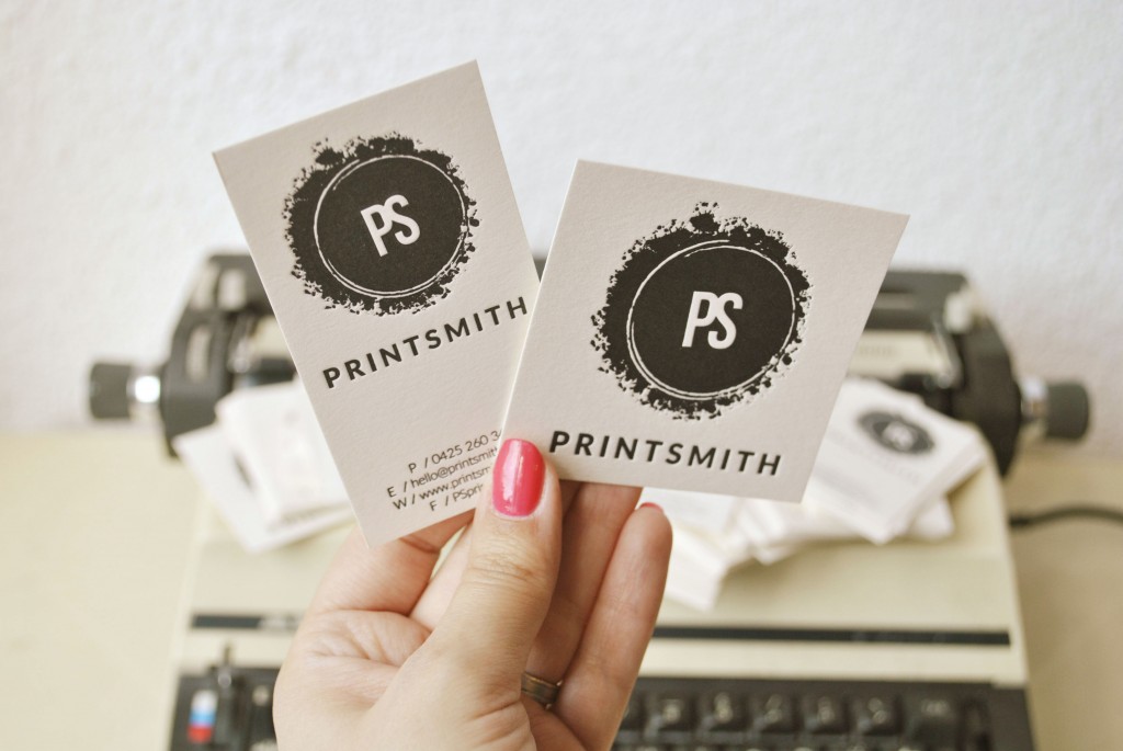
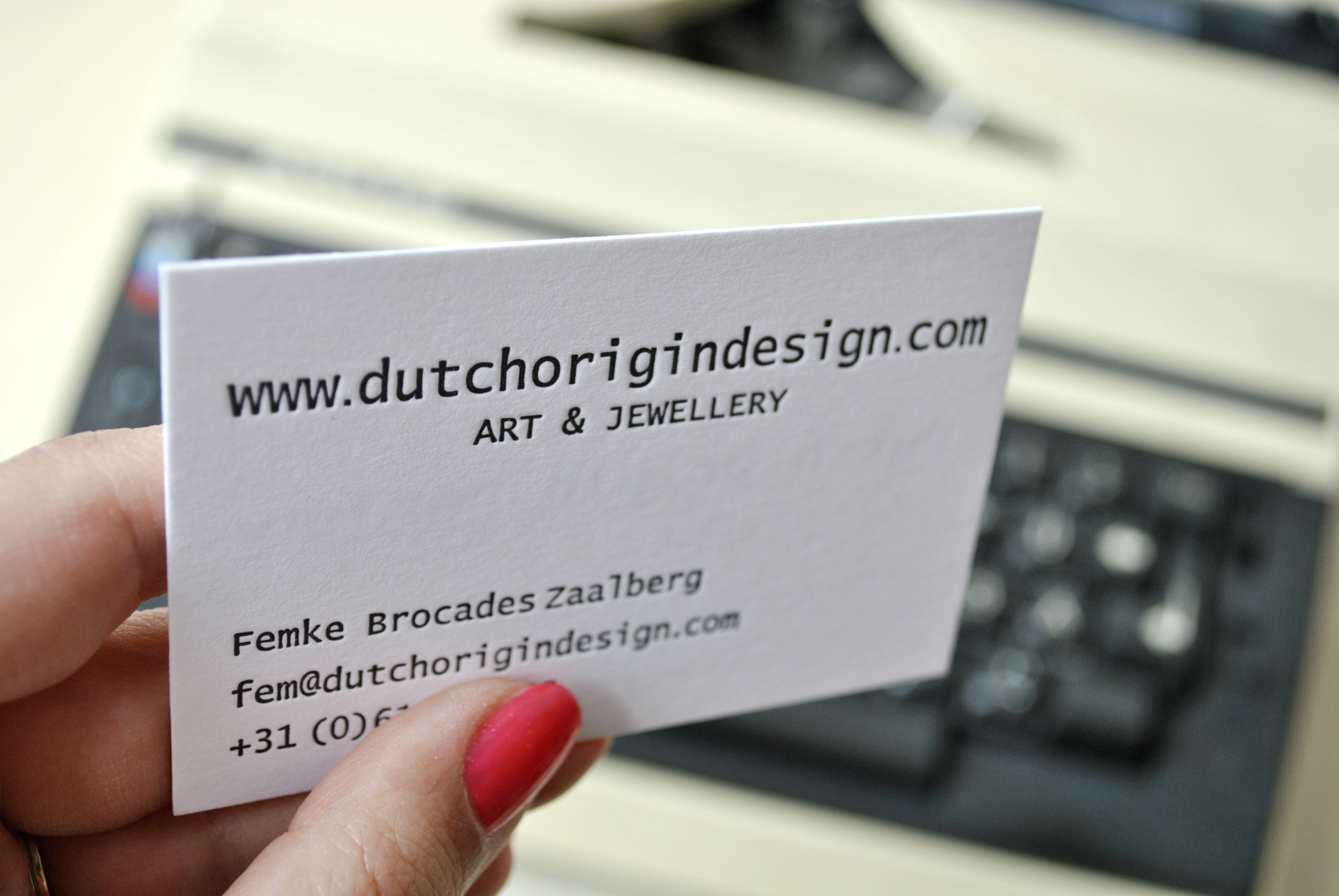
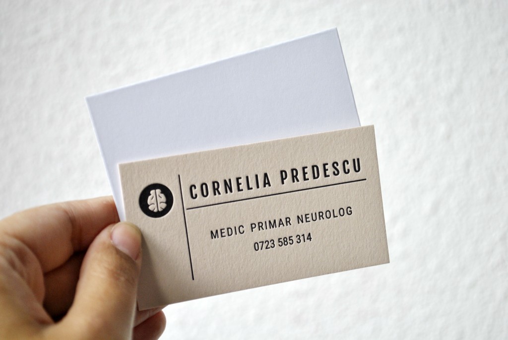
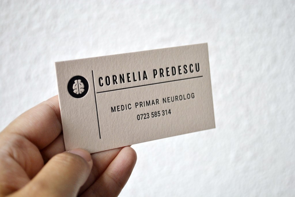
The custom letterpress calling cards i’m talking about today were created by us from scratch. I really enjoy creating designs for business cards, so when i was given a free hand with these i was ecstatic! I played with a bunch of various fonts in order to find the perfect one to emphasize professionalism and seriousness, while at the same time leaving a long lasting impression by adding the brain logo. I may not be a neurologist like the owner of these custom letterpress calling cards, but i’m pretty sure this is how one would like to come across as: professional, serious and reliable.
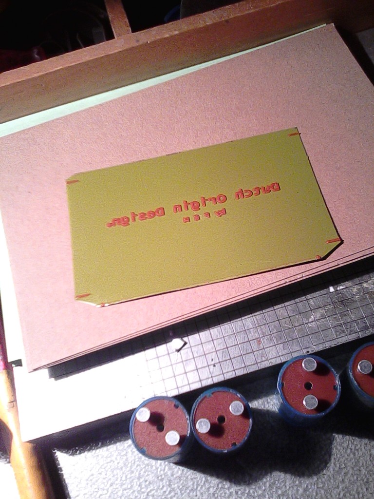
Creating designs for letterpress cards is definitely not as easy as it may seem as there are a bunch of things to take into consideration. Letterpress printing is completely different from regular, digital printing. The most important thing to mention is that if you searched “less is more” you should get “letterpress” as a result. You know how in fashion there was that thing that Coco Chanel said: “Once you’ve dressed, and before you leave the house, look in the mirror and take at least one thing off.” This works perfectly for letterpress printing also. Well actually doing it, actually creating a design that is airy, yet with a powerful impression, simple, yet elegant, well that is not that easy. Moreover, there are tons and tons of available free fonts out there. Some of them look a lot better letterpress printed than others, so you need to envision each one and carefully choose the best option. Proportions are also very important; while you want the information to be visible, you don’t want it to take over the entire space. At the same time, don’t let the logo entirely overshadow the information. There has to be a balance, you have to find the right proportions so that they represent your brand, company, profession as a whole.
I got a little carried away there, didn’t i? Well anyway, this template is available to be used for various other professions as well; i’d change the brain logo with another to accommodate the requested profession. Also, i absolutely love the color of the Biscuit card stock so i plan o recommending it whenever and wherever i can! Here are the short technical details about these custom letterpress calling cards:
- 450gsm Biscuit (light brown / chocolate milk) card stock, one side printing, 9 x 5 cm, black ink, custom design

 I’ve already added these custom letterpress calling cards on our portfolio, so you can check out more photos over here.
The Funky Studio team wishes you, as always, a colorful day!

